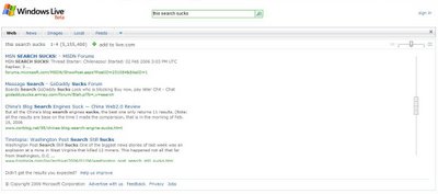
Windows Live Search Revisited
I must give credit where credit is due. Since my last insulting post, the Windows Live Search folks have already started fixing things up over there. Good job guys. You still have a long way to go. In case you are interested, here are the things that keep me from liking your work. Please accept this as constructive criticism rather than blatant bashing.
1. Though the scrollbar is no longer horrific, it is still inadequate. Really, I want my scrollbar. You know, the real one. But if I can't have that, at least make it feel the same. If I want to zip down through results, I need to be able to do that with my scroll wheel as I am accustomed to doing with everything else in your operating system.
2. Give me back my back button. If I do a second search on the site, I want to be able to get back to the first one in one click. Even if I scroll through several 'pages'. And when I go back to a Live search from somewhere else, I really don't want to wait while it figures out what to load for me. In fact, the word "loading" does not belong on a search engine. Ever. It's now or never.
3. Advertisers (like me) are not going to be happy with the wild and wacky ways they get displayed in this thing. As I'm sure you realize, the problem here is the 'infinite scrolling' results. Magically refreshing ads as one scrolls is a great way to make sure that most advertisers in the list don't get noticed. Cutting off ads at the bottom is also bad form. Fix that.
4. The 'infinite scrolling' results page thing. I don't like it. I don't need it. If your search engine was any good, and I'm not saying it isn't, I shouldn't really need any more than 10 to 20 results anyway. Right? Right. This thing you've cooked up is disorienting. When I'm scrolling through results it quickly becomes difficult to tell exactly where I'm at. The numbers are there, and that's nice, but I don't really go by the numbers. Is that listing 24, or 27? Was that 3 slow scrolls down, or was it more like 5? I can't remember. It should be somewhere between 20 and 50. Really guys, which seems intuitive and usable to you: "It's on page 2," or "Scroll down until you hit 11-17 or so"? Which of those is easier to remember, communicate, and replicate?
So really, my biggest beef is with the interface. In my mind, you've made something that was very effective when it was simple, into something that is now too complex to be useful at all. Why go with all that bulky scripting, when you can do the job better without it? I don't know about you, but when I do a search, it's because I want to find something. I want to find it instantly. Anything that gets in the way of that should go. What you have designed is like a fairly unattractive but very tricked out street racer. It's flashy, but it's kinda awkward and it's totally doomed when it's up against a pro dragster. Your form is impairing your function, and I think you know quite well that this game is all about function.
Good luck.
Tags: windows live microsoft search


